What the… design!

Our heart beats for software - really good software. And at Whiskey Tango Foxtrot, we are breaking up dusty approaches to development and traditional technologies.

WTF_macht_Mode_Header

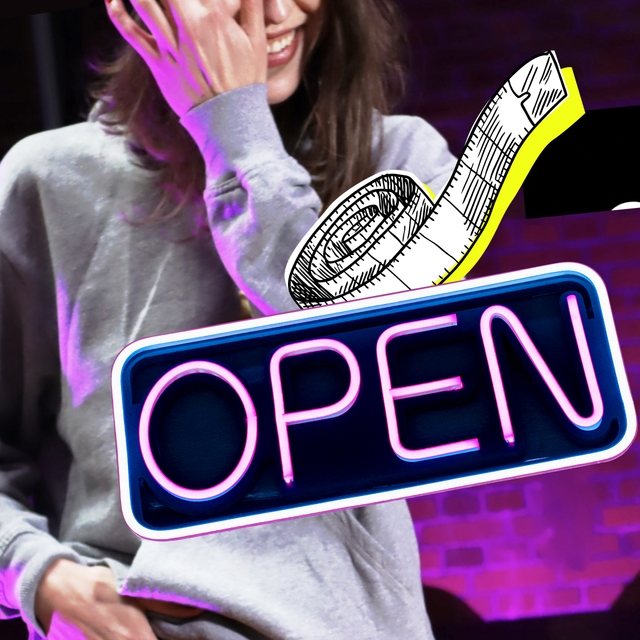
With our philosophy and polarising methods, we are heading in a completely different direction than established providers who usually end up implementing inflexible standard products for their customers. But how can we also convey the essence of our company visually? How do you turn a company into a unique brand that falls outside the classic grid? These were exactly the challenges our Chief Marketing Officer Luigi and his team faced when it came to developing a brand and corporate design that unmistakably reflects our identity and can withstand any trend. A brand that expresses the emotions that we associate with Whiskey Tango Foxtrot and that we want our customers and partners to feel. Originals We are knowledge-hungry and curious. We strive to constantly develop ourselves further. To do so, we must continuously question whether the solutions for our customers and their users offer the highest added value and are up to date. As a result, you inevitably experience "what the..." moments again and again. **It was probably one of these "what the ..." moments that set the foundation for our quite polarising name!** We focus on the essentials: technologies and methods that are all about the matter at hand - without self-indulgent frills and without chasing after short-lived trends. Whiskey Tango Foxtrot develops sustainable and constantly evolving solutions in partnership with our clients and their users. "Back to the basics" and at the same time "back to the future". **Our visual identity reflects exactly that - the colours are based on the primary colours red, blue and yellow and form an important basis - representing ambition, emotion and rationality.** The central visuals are mostly collages of simple images - inspired by Dadaism - which as a new composition open up a whole new perspective and question the previous point of view. And last but not least, a typeface that adopts three typos and underpins the three values with the colours - ultimately to create evolutionary technology, build sustainable partnerships and achieve maximum user-centricity. How? Through a holistic service spectrum of front- and backend development as well as UX, UI and visual design. **Our heart beats for software development. And really good design. Did we mention that already?**

Also interesting:

All
absolot_Header

Absolot. The Online Revolution in the Lottery Industry.

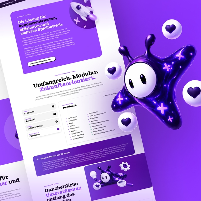
The German lottery market is changing. Absolot is the platform built for exactly that.

WTF_Artikel_Top_10_von_Top_100_Header

Top 10 at TOP 100: Our Award in Heidelberg.

We were at the TOP 100 award ceremony in Heidelberg. The takeaway: you don't make top 10 with one good idea. You make it with a hundred small decisions, every day.

Radikaler_Wandel_Recap_Headermotiv

Radical Change. The takeaway.

Our video series “Radical Change” was not a playbook, but a look at what really happens in transformation. The takeaway: What’s missing are decisions that truly drive change.